Video page
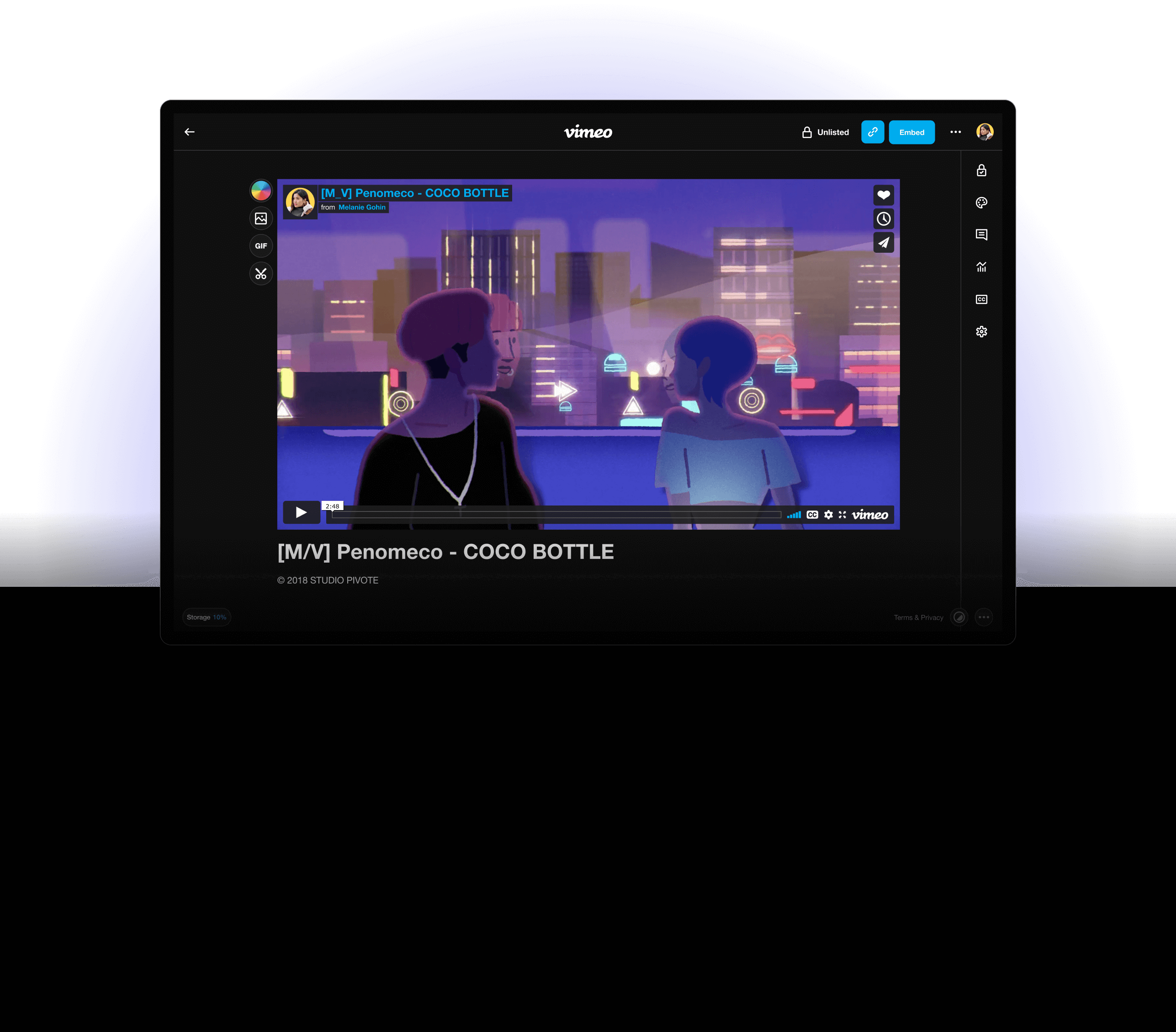
A new simplified Vimeo.
01
BRIEF
On 2017 Vimeo shifted from a viewing destination to focus on video creation. During that time, video itself had grown to become one of the primary mediums of storytelling and communication.
With this shift, Vimeo introduced numerous tools for video creation, collaboration, analytics and more - but the discoverability and engagement of these tools was still low which signaled an opportunity for us to evaluate our existing infrastructure.
My team and I led this new effort to create a new simple, streamlined workflow for uploading and managing videos at Vimeo. This was a massive undertaking at Vimeo that would impact every existing and new user.
*To comply with my non-disclosure agreement, some information has been omitted.
YEAR
2019 - 2021
MY ROLE
Product design
Strategy
Research
Prototyping
PRODUCT
Self - serve
Enterprise
02
CHALLENGE
An infrastructure with growing scalability pain points.
Vimeo's product IA was still constructed around a media consumpton use case (i.e. Youtube). As Vimeo was changing and growing quickly, the product teams were rapidly adding features and tools to the platform for creators.
However - Vimeo's platform foundation wasn't solid enough to scale for increasungly complicated product initiatives. As a result, users had difficulty finding features.
Our user group had evolved.
We've seen a massive shift in our user base with an influx of small businesses, agencies and organizations coming to Vimeo to continue to grow their businesses and drive impact using video.
Goals and principles.
Our workflow at Vimeo was deeply rooted as a video destination. As a result, all our investments in tools to help users create, manage and distribute were completely bypassed due to isolated workflows. We set new goals and principles to guide us towards a new more simplified experience:
Discoverability
Increase the discoverability of tools and features at Vimeo.
Engagement
Increase engagement with tools and provide experiences for users to try them.
Simplification
Introduce a more simplified and seamless flow for video upload and management.
Branding
More opportunity to customize the look and feel of your video page.
Video front and center
Making sure video remains the vocal point of the page.
Build to last
Build with NextJS with a fresh new foundation to support future initiatives.
03
DISCOVERY
Conceptualizing the right solution.
We kicked off our research by speaking directly to users. With the help of our consumer insights team, we were able to put together a Vimeo advisory group comprised of all types of users at Vimeo.
Our goals through this period was to get answers to the following questions:
"What are the most commonly performed actions?"
"What flows do all our users have in common?"
Themes.
Our exploratory user research allowed us to get a glimpse at the workflows from each user, ranging from free, paid, small and large organizations. Even though these users had similar goals - they all had a different workflow or ways of finding things. The most common them we found through our research:
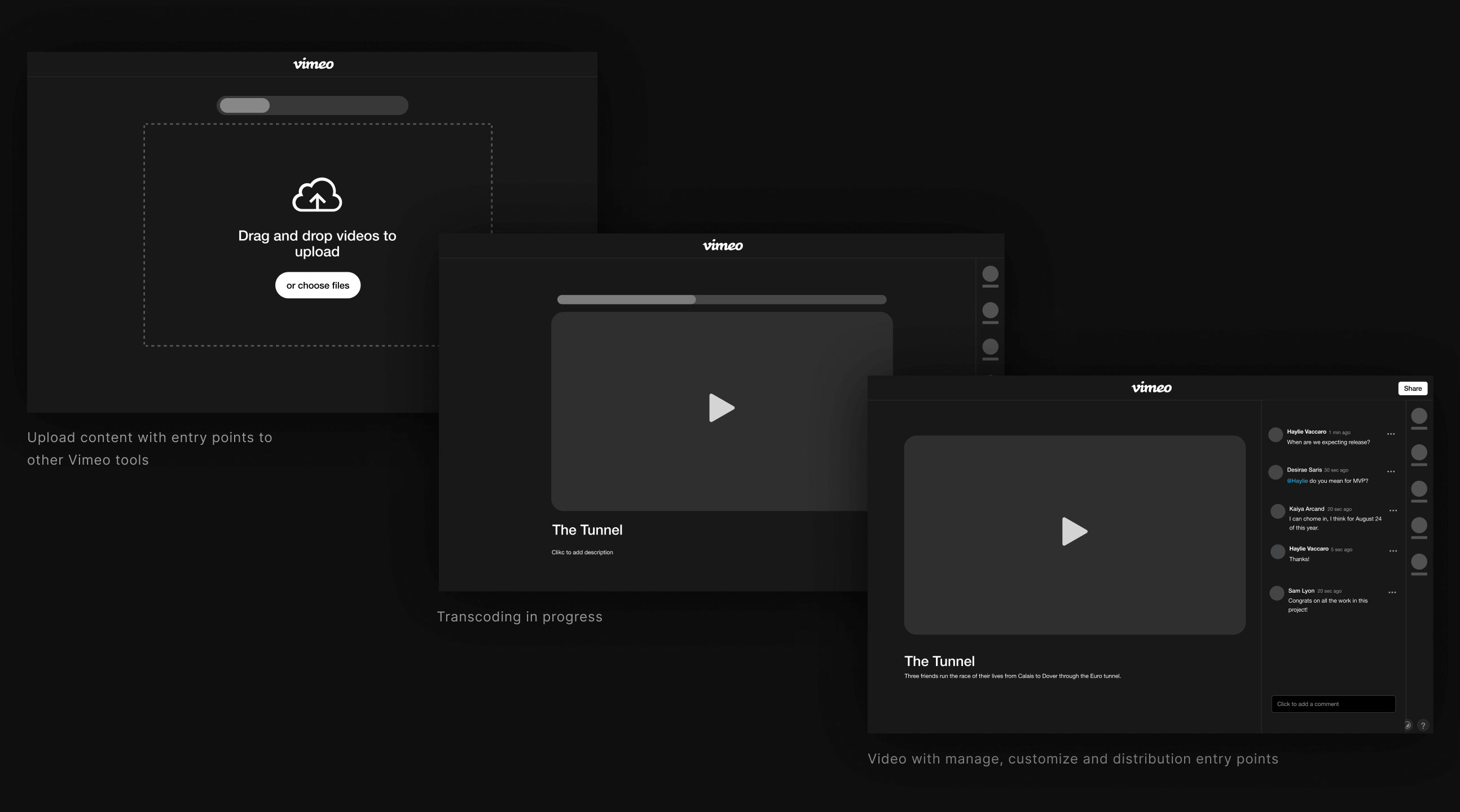
Working closely with my design director, product director and design manager, we developed a new flow based on the learnings from our discovery phase and developed a flow that would simplify the path for users uploading, managing and distributing using Vimeo.
04
SOLUTION
Inspiring users with our new model.
This new flow was one of the biggest changes we had done at Vimeo in a long time. I created concepts based on the new model and continued to use feedback from our Vimeo advisors and previous studies to give the project form.
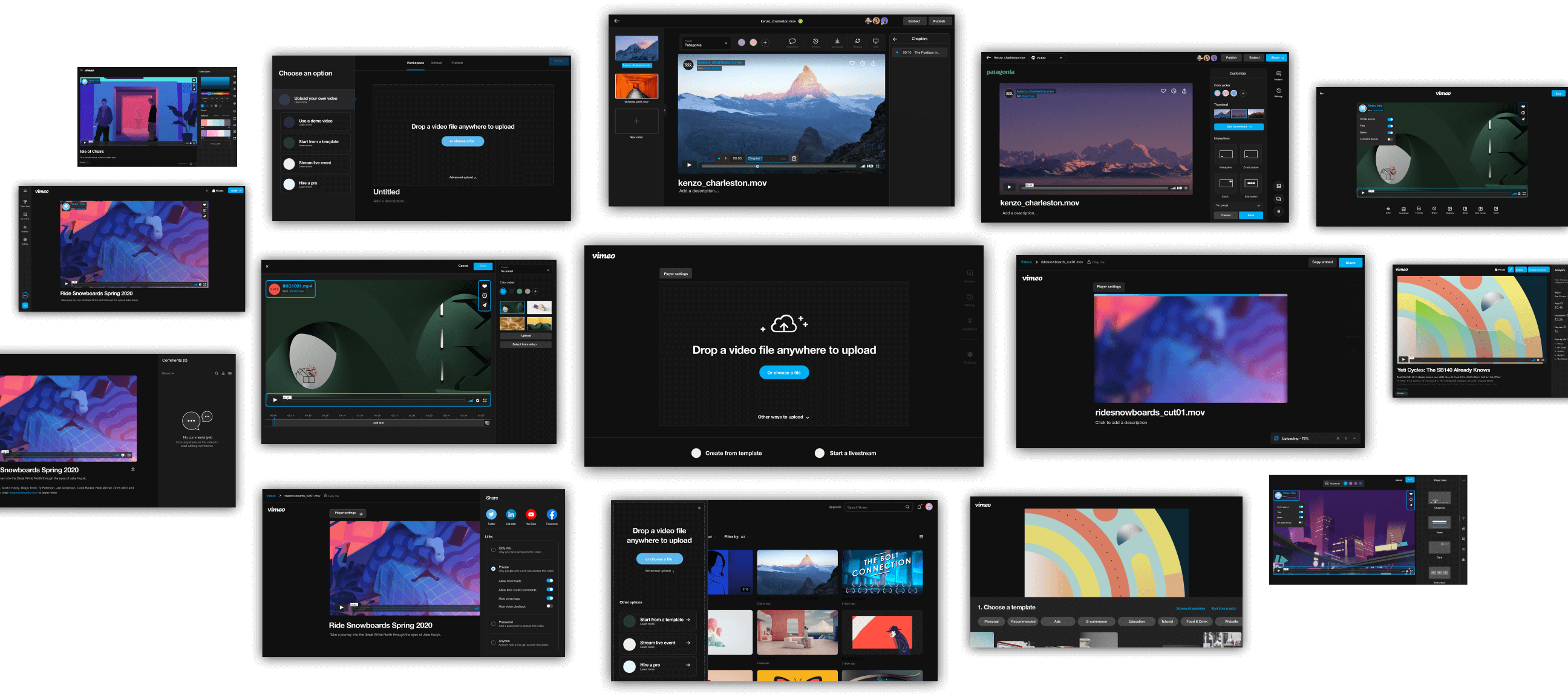
What we heard.
"Looks good, it’s very simple. I know exactly what I need to do.
It makes me want to explore what start from template or record will do. I hope you guys will go forward with it. It’s a lot cleaner.”
05
LAUNCH
The biggest update on Vimeo since 2016.
On December 2020, we launched the new flow in small increments so we could monitor and measure impact, which allowed us to continuously evolve and polish.
We continued to increase the percentage until early February 2021 the experience was launched to 100% of user traffic.
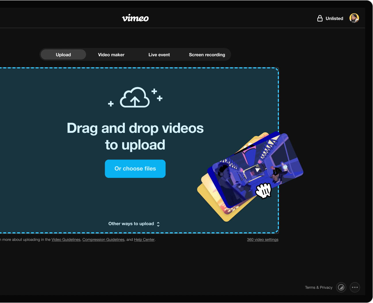
More ways to upload.
New upload page provides entry point to not just upload videos, but now you can create videos, go live and start a screen recording.
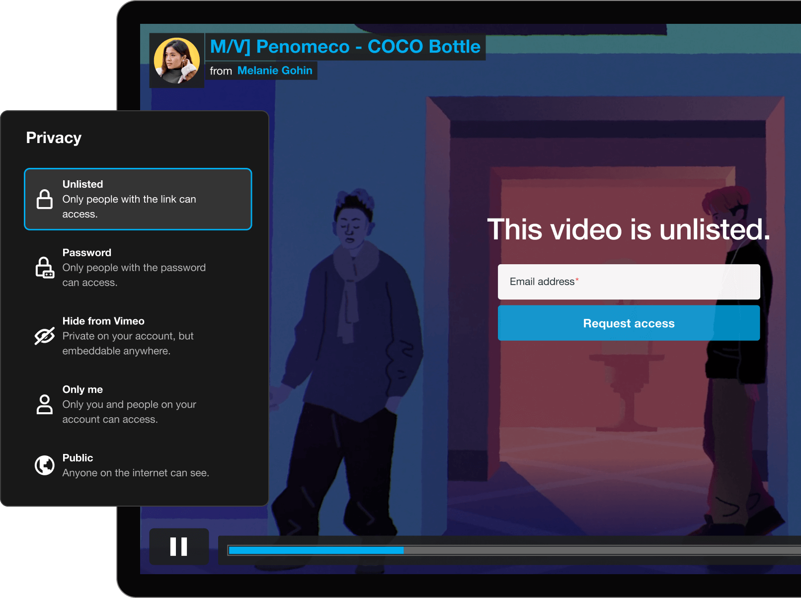
Improved privacy settings.
Consolidated privacies that introduces more flexibility for privacy like password protected and unlisted.
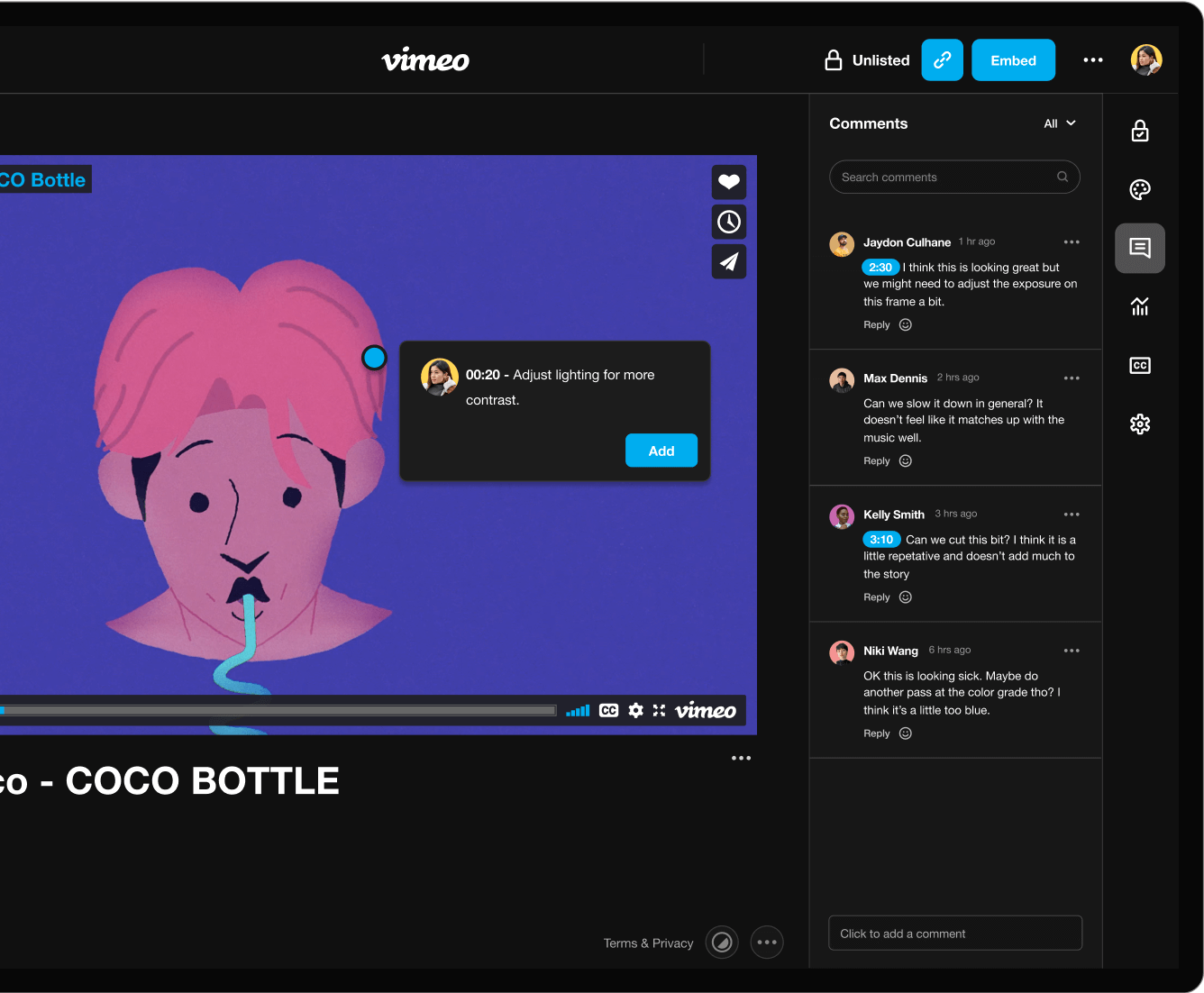
Video settings, made (even) simpler.
You can now access your privacy settings, player customization options, team tools, and analytics all from the same video page.
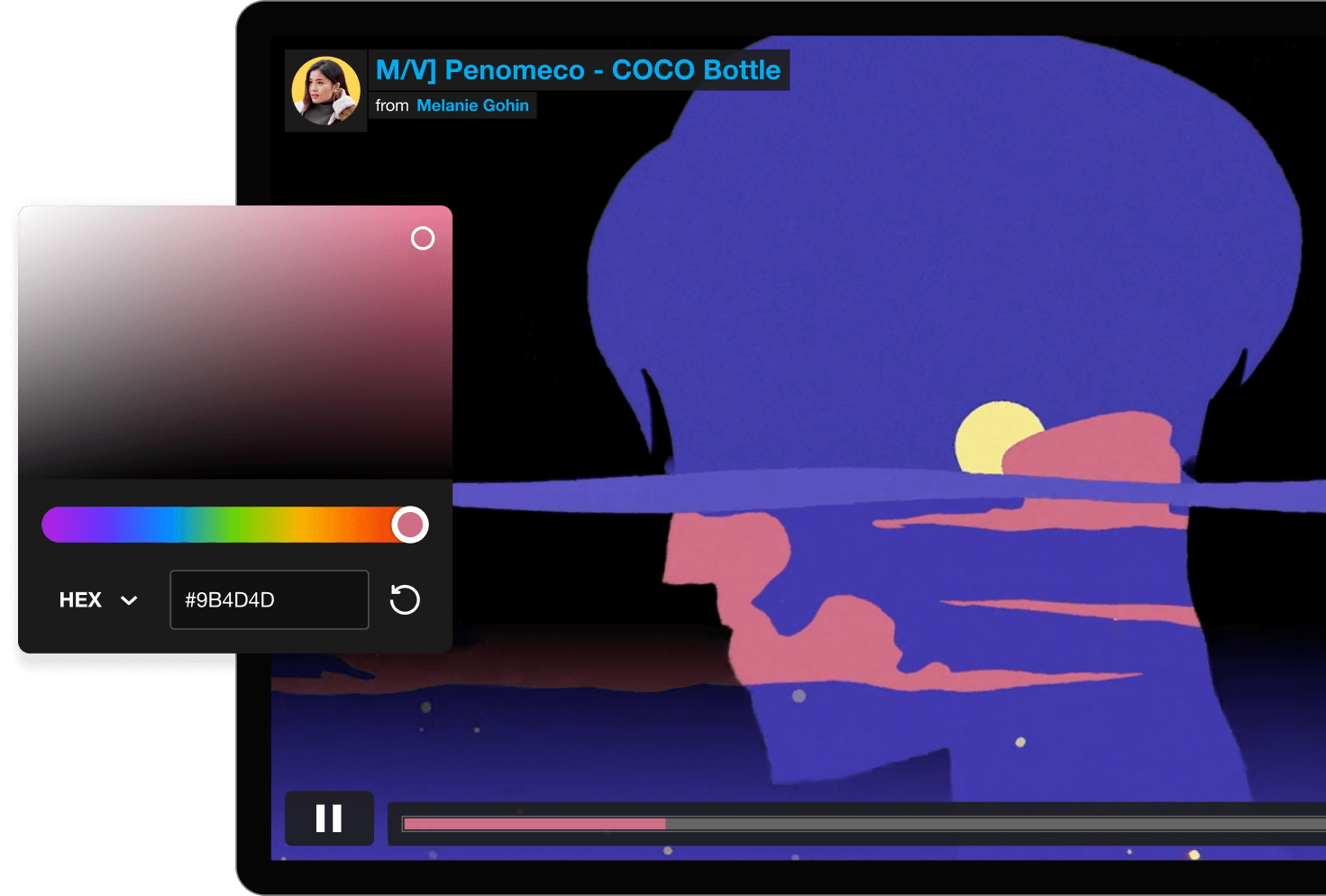
Real-time player customizations.
Customizing your video’s player should be fun and easy! We wanted to give access to these customization on the new video page itself, allowing you to dynamically see your updates in real-time. .
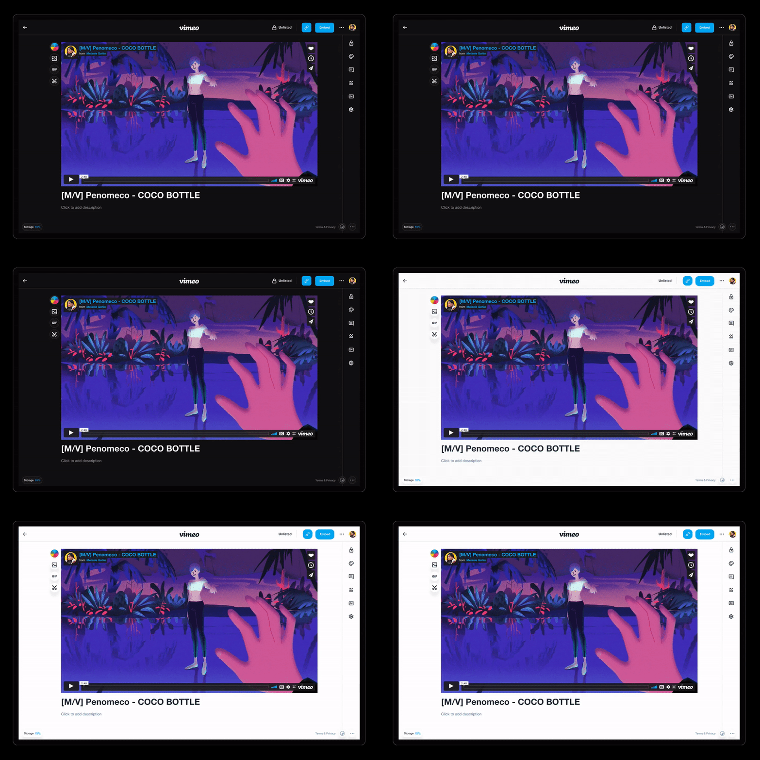
Dark mode.
Dark mode is finally here, giving users the option to toggle on the dark mode setting in the lower right corner of the page to switch to a dark background.
06
IMPACT
An overwhelming positive response from the community that made us.
Since the release, we have seen a lot of positive impact directly from our community - all our efforts validated by them. In the months following the release, we also continued to gather monitor and saw a significant increase in discoverability and engagement across the board:
2x
Increase on our first time suscribers.
76%
Increased our CSAT score to be much higher.
60%
Increase on accounts adding team members.